Sunday, 19 August 2007

Global Cities Exhibition, Tate Modern exhibition


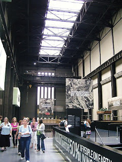
The global cities exhibition exhibition is about people and places and making people aware of what the growing populations of cities is going to mean to them.
The main thing which is evident when I entered the exhibition space was the shear volume of information, but the key to this exhibition is that it has many ways of displaying information to guide you through learning without feeling overwhelmed with information.
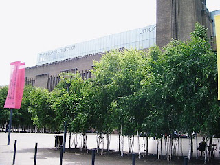
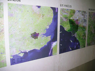

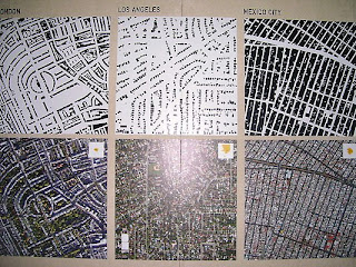


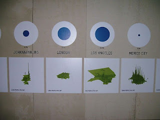
There are images of the various urban areas displayed in a number of different graphic styles. different colours, tones and lines help to create this difference, so no one piece of infomation is interpreted as meaning the same as the last. The photo above was a very good example of how imformation was broken down into these different styles.
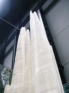
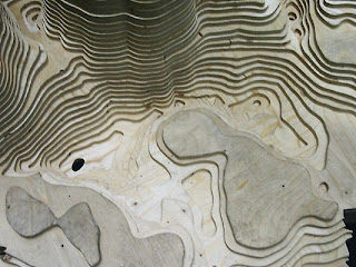

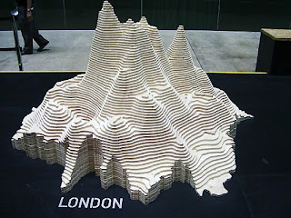
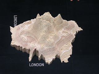


The most effective means of visually displaying the demograhics data in this exhibition was probably the 3D models representing space of the city and population density. These at times seemed like giant termite mound, however were in my opinion the most interesting visually displays of information. There were five city models and each showed such differnt characteristics to one another, it was a fascinating way to represent this kind of data.

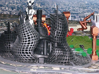
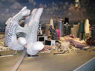

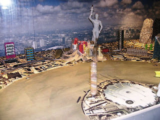

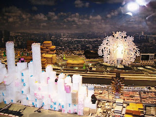


The fun of this exhibition was the way in which information which is usually displayed in boring graphs or charts, has had a sense of fun injected into it. The model of London was an example of this it had a 2D detailed colour base plan of London but key landmarks and features were picked out using any number of different materials, each material had some significance to the actual area. The cotton reals are tower blocks in the financial part of london representing comodities and trading the westminster/parliament area of London was represented by an amalgamation of tourist trinket. This was a really playful model which experimented with materials but put real thought into how they were used.
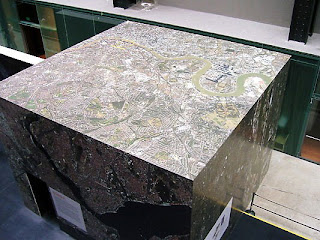
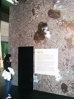
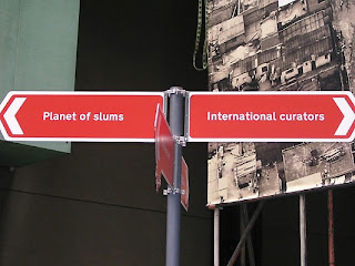
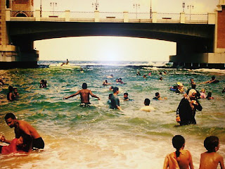
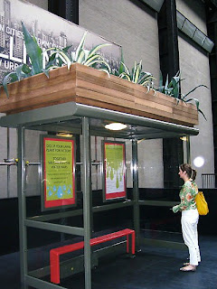
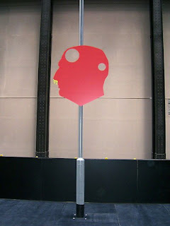


The exhibition used varied media to represent information which most of the time would be statistical charts and graphs. The fun and thought really translat through the works even subtle things such as lamposts and signs with messages on them to bus shelters with plant boxes on top of them. This is definately an eye opener for how to use varied media in such an effective way.
London Eye visit


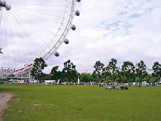
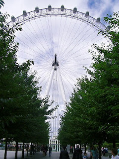
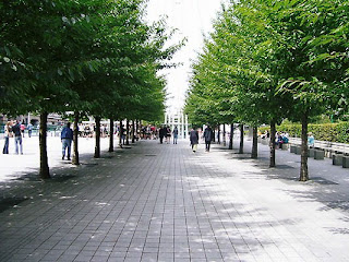
The London Eye has become one of the most iconic modern symbols of London to date. The eye is a very impressive well thought out structure and offers such great views across London however once you stop looking up from the ground and take in the surroundings of the eye it feels like very little effort has gone into this landscape. The park adjacent to the Eye is a worn down lawn with litter all over the footpaths which cut it, are undesigned and tatty. There is no real effort in this park and it is quite disappointing when the views all around are so grand and prestigous yet the park is not.


The immediate walk up to the London Eye from Waterloo station has been well crafted to suite the site it channels ones view to look toward and up at the Eye really making it more of a focal point. The tree lined pathway lights up at night time guiding one through, also along one side of this are seating made of granite all along the bounding wall. Without the London Eye this large park area would fail on every design level in my opinion but the London Eye experience really makes anybody forget the immediate area and cast their eye across the spaces of London.

Designing Modern Britain exhibition


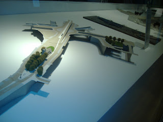
The designing modern Britain exhibition was very informative and had a variety of different style designs throughout. The designs range from very graphic based images to architectural pieces, such as the models featured in the photos. The 2012 olympic games designs were a dominant feature throughout the architetural section of work. Overall the exhibition was quite informative but did tend to wonder through many subjects and design fields which at times became confusing.


Saturday, 11 August 2007

Friday, 10 August 2007

Thames Barrier Park visit

Thames Barrier Park is the first riverside park to be built in London for over 50 years. Since it opened in late 2000, it has won design accolades from the Royal Institute of British Architects, the American Institute of Architecture and the Civic Trust Award in 2002 for landscape design.


The central sunken garden is the focal point to the park. The garden is sculpted to reflect upon the historic culture of the site the park is built upon, which was once one of London's many working dock yards. The old dock yard now acts as an axis on which the parks many features are planned around.


The planting of the sunken dock garden suggests a relationship to water, because of the wave formlike sculpted into the planting throughout. The maintainance of the wave sculpture is high with a small team of gardeners constantly pruning and maintaning it, however there are some neglected areas which suggests the vastness of such constant maintainace.


The park uses high quality materials for construction throughout. Examples of these materials include: polished granite edgings along the parks retaining walls, engraved glass panel's encompassing the visitors centre, extensive decking throughout the park and well maintained sculptured planting throughout the park.


Thames Barrier Park is at times confusing in design with the focal point the sunken garden blocked off from use at some points. The intricate shapes of the planting are very effecting but let down by large patches throughout that are bare because of dead plants or loss of shape from not being maintained. The park itself is a very safe feeling park with no obvious signs of vandalism and is by no mean over capacity giving the individual visitor a good sense of space.